
(Image credit: Burger King Corporation)
A short signposting one, as it is Friday and I’m not meant to be working…
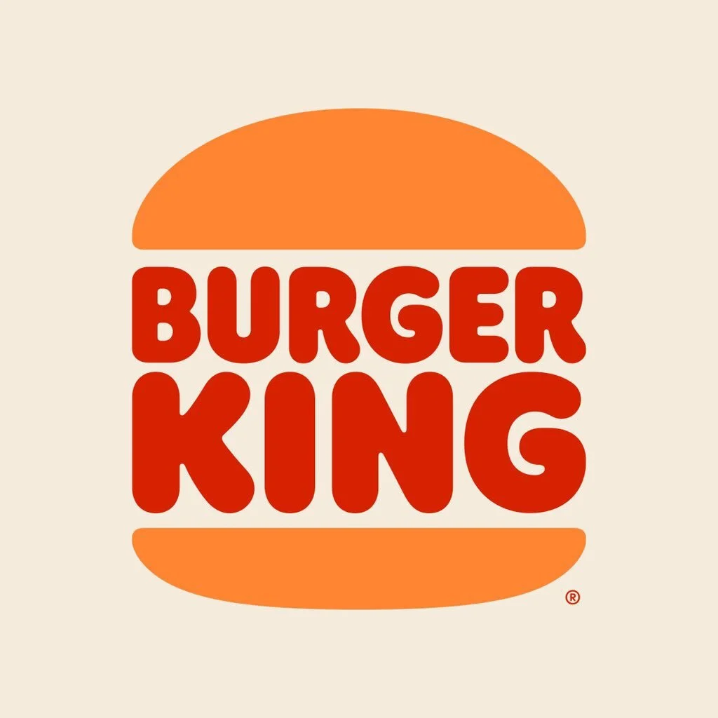
After seeing a tweet heralding the rebrand of Burger King – its first redesign in more than 20 years – I thought I’d take a closer look.
The Burger King rebrand – logo, font, design overhaul

Courtesy of Its Nice That – Burger King GIF of graphic design and new branding (Image credit: Burger King Corporation)
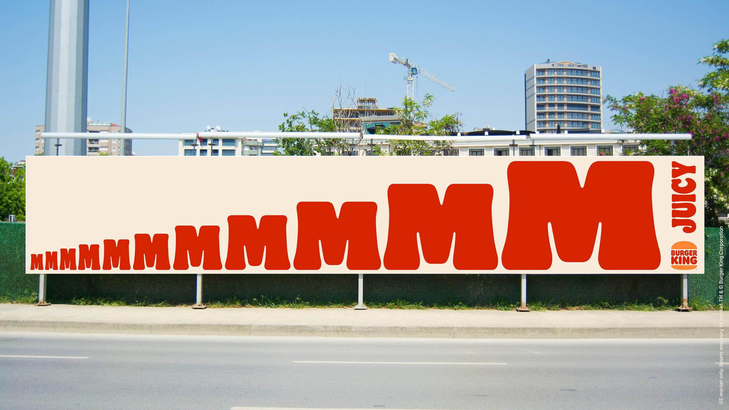
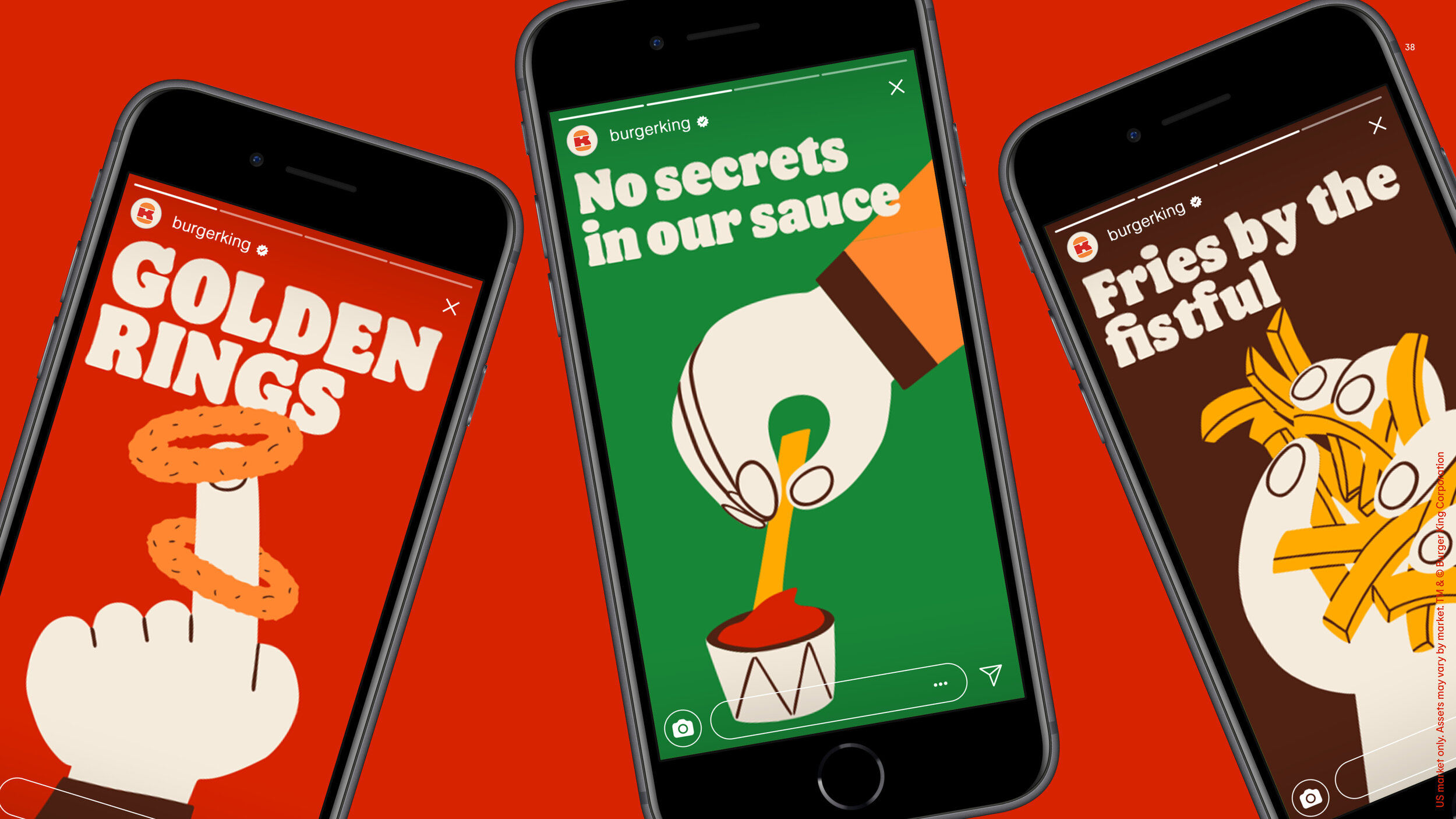
The first Burger King rebrand for around 20 years has taken inspiration from its heritage, with 1960s/1970s colours, stripped back font and echoes of the dawn of the fast food revolution. “Deliciously retro” as CreativeBloq says.
As Fast Company notes, the new brand identity includes “a custom serif typeface and retro colors, like mustard and burnt orange, that mimic the organic shapes and colors of Burger King’s menu items.“
Wicked design blog It’s Nice That (give them a follow), says it “introduces a brand font inspired by the shape of its burgers, with a rich new colour palette, to create a more digital-friendly identity.“ Clever from BK, and parent company RBI (Restaurant Brand International).
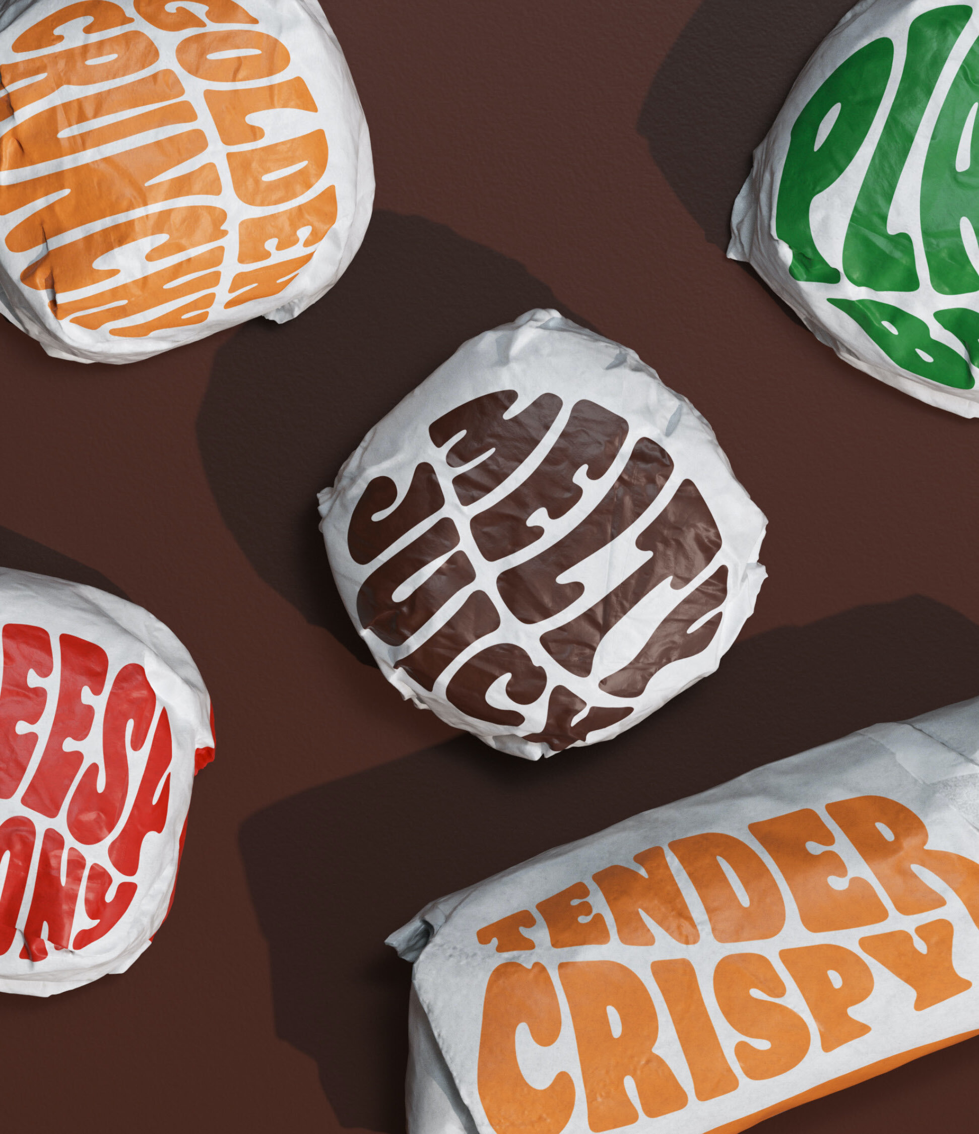
Kudos where it’s due to design agency Jones Knowles Ritchie, who seem to have nailed making Burger King “feel less synthetic and artificial, and more real, crave-able and tasty.”
Thanks for the flag, Patrick Schreiner. As you rightly say, it is both “trippy and amazing”.T

Read more about the redesign, from far better designers than me, on:
It’s Nice That – The Burger King rebrand celebrates its design history and irreverent personality
Fast Company saying “You can almost taste the typeface” – Burger King unveils its first major rebrand in 20 years